With the launch of iPad, website developers are now facing a number of complex problems that are intimately associated with the layout of a website. However, you need to have a fair level of authority on CSS if you wish to ride past these trivial issues easily. This is the reason why not every experienced web developer is up against arms against iPad. Actually managing CSS3 is not much of a challenge unless you are a novice in this field. However, the platform is certainly new and therefore, you need to tread on cautiously.
There are a number of issues that you need to give utmost attention and some of them are described in details below:

Hover Effect and Links
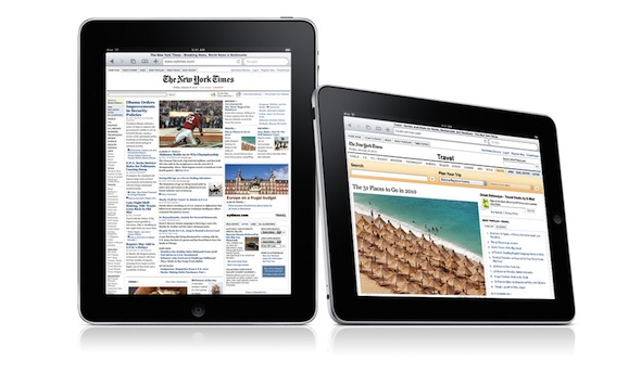
As you all know, iPad comes with touch screen and therefore, it is quite clear that you need to employ a different technique this time around. You need to be a little particular while placing images in a website. Try to avoid text links rather; you should use large images, as it will add to the tactile nature of iPad, which will in turn make your website all the more interesting and engaging. But you should not try the old hover technique with the CSS3 because it will not have the same magical effect on iPad. You should not forget the fact that jQuery is not ideal for i-devices.
Use of Some CSS Properties
You can give a fresh look to your website by using these properties:
”Position: fixed”: This property will not work in Mobile Safari but still it is good enough to jazz the appearance of your website in iPad. By using this property, you will be able to position things more efficiently and effectively.
Think About Orientation
iPad gets accolades from varies sources for its amazing landscape and portrait modes but they are not CSS friendly at all. Therefore, it is quite evident that you need to do something proactively to make your website look equally good in iPad in any of these modes. The only way, you will be able to deal with this intricate issue is by creating two different CSS files : portrait.css and landscape.css . This is what you have to do:
[code] <link rel=”stylesheet” media=”all and (orientation:landscape)” href=”landscape.css”><link rel=”stylesheet” media=”all and (orientation:portrait)” href=”portrait.css”>”
[/code]
Do not Use Frame
You should not put your online reputation at stake by developing your website in frame. Frame will come with a number of issues that includes content overflow, unruly webpage etc.
As iPad web development is relatively a newfound area of work, you might face a number of issues that you have not experienced before. Therefore, you need to be prepared to face new challenges.
Source: Quality Web Programming